P9: Portfolio

  • Portfolio (Scribd.com):
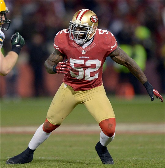
  • Project Corrections / Time spent: I spent about 4 hours correcting my projects. I resized the montage project and got rid of the football because it looked awkward and out of place. With the Word Project I adjusted the lines and fixed the spacing. I also made corrections to the Logos. i changed the background of the mountains on the first logo and moved them down, then I created an outline of a condor and using the shape builder tool I made the bird to be above the mountain. I also moved the name of the company down into the white mountain outline. Then I looked at the second logo and decided that I needed to fix that, I made the door red and added a gold doorknob. I also made the words line up with the edges of the door so that everything flows nicer. I made some adjustments to my business cards as well, I moved the company name further away from the bird logo and I moved the bird logo away from the edge of the business card.
  • Message: I wanted this to showcase all of the skills that i learned over the semester so I put the new designs into my portfolio instead of the old.
  • Audience:  For this project, the audience is my Comm 130 class. I could possibly use it for job offers in the future
  • Top Thing Learned: I learned that trying to find a good background and contrasting font for your portfolio is incredibly and surprisingly difficult
  • Future application of Visual Media: I will look for opportunities to improve my design skills and to use them in my chosen field
  • Color scheme and color names: Monochromatic (Green)
  • Title Font Name & Category: Titles, Rosewood (decorative)
  • Copy Font Name & Category: Body:
  • Thumbnails of Images used:

bamboo

  • Sources (Links to images on original websites / with title of site):

http://bgfons.com/upload/wood%20_texture561.jpg


P8: Brochure


P8CarsonMerrill-Inside

Inside


P8CarsonMerrill-Front and Back 

Front/Back

Description:
A three sided (tri fold) folding brochure.

Process (Programs, Tools, Skills):

I set up the gateway fold in Adobe InDesign. I split my layout into 3 sections with the concept that the two outer pages would be on the first indesign page and the next 3 would be on the second InDesign page.

I used the Pacers own shade of blue so that it creates the sense of actually being put on by the Pacers. I used basketball photos because it’s advertising basketball camps, and I used pictures of Paul George and Frank Vogel because the are going to be present. 

For all of the images on my brochure I put them first in photoshop and used the polygonal lasso tool and after I had cropped the image I put a mask on the image. After that the blue could show through the image. 

I created the logo in Illustrator using the shape maker tool and then I placed it into Photoshop. When it was in photoshop I did the same that I did with the images and cut it out and put a mask on it so that it would be transparent. 

Programs/Tools Used: Adobe InDesign/Adobe Illustrator/Adobe Photoshop

Message: Inform my audience about the Pacers skill camps. I am advertising that anyone can come and sign up to learn from the star of the team and it’s coach.

Audience: Pacer and basketball fans that want to get better at basketball or that want their children to

Top Thing Learned: I learned how to set up the measurements on different pages in indesign to fold a brochure correctly

Color scheme and color names: Monochromatic: Pacer Blue

Title Font Name & Category: 

Copy Font Name & Category: Perpetua / Sans Serif

Word count: 277


basketball frank-vogel-pointing Indiana Pacers

NBTA  

136214592GJ020_IND_DAL


Links to Images:

http://ecx.images-amazon.com/images/I/81fi%2BmmwnaL.jpg

http://www.themarsreel.com/wp-content/uploads/2013/05/frank-vogel-pointing.jpg

http://www.themarsreel.com/wp-content/uploads/2013/05/frank-vogel-pointing.jpg

http://www.bubblews.com/assets/images/news/2089198402_1390115401.jpg

Project 7: Web Page Project

P7CarsonMerrill

Description: A webpage designed to showcase a logo that I created this semester

Process: I had never had any interest in any type of code or anything about designing webpages. I used TextWrangler for every part of the “coding” and it made it much easier. TextWrangler is a dream to work with, it seems almost too easy. I used http://www.W3.org  a lot to check if my code was correct. After I had made sure that my html document was correcct I attached a CSS document to it that was pre-made for use. I took colors from my logo and the background image I placed in the webpage, and I used those for the text. I did this by using the eye dropper tool in Photoshop and found the hex codes for the colors and put that into the CSS document. I set the fonts to Times New Roman, Verdana, or Geneva because those seemed to be the best fit.

Programs/Tools used: TextWrangler and Photoshop

Message: The Condor Outdoorz company is where anyone can go to access the outdoors and all the equipment needed for any activity.

Audience: Anyone interested in doing anything outside

Top Thing Learned: How to correctly write and edit html and css documents

Color Scheme: Complimentary: Red (d80707) Black (000000)

Font Families (Body): Times New Roman, Arial, Sans-Serif

Font Families(Header):  Verdana, Geneva, Serif

Changes Made to CSS: I changed the fonts and the colors.

Project 6: Stationary

letterhead


bigbusinesscard

businesscards


Description:Letterhead and business cards using an original design
Process (Programs, Tools, Skills): I started in Illustrator and made the boxes for the business cards. Then, using simple shapes I created the condor head and beak. Then I put the logo and the boxes in indesign. I created The letterhead as the first page in Indesign, I used the rectangle tool to create the colored boxes then added the text. I then added some contact information and using the elipse and line tools I made little footballs. Which seem to have gotten a little transformed and smashed in the post design process. Then I took the logo I made and put it in as a watermark at 10% opacity.

I moved the business cards to the 2nd page. I took the color from a football field and made it the background color for the back of the card. I used the line tool to create the hashmarks and copied the idea of the 49ers logo for the middle logo on the back. For the front of the card I placed the Condor logo and wrote condor sports and pasted my contact info.

Programs used: Adobe illustrator and indesign
Message: In Inca legend the condor brought the sun. The message is that condor sports will bring success in the games you play.
Audience: Those in need of sporting goods
Top Thing Learned: Making a bird in illustrator is tough
Color scheme and color names: Complimentary; Red, Green

  • Title & Body Font Name & Category:


Project 5: Logos

Untitled-1


Description:
Three logos
Process:This was an interestingly frustrating project. Illustrator is confusing and infuriating. I used mainly the shape creator tool and the pen tool. The 1st logo I just drew a moon, and then a silhouette of a mountain range. I was going to try to draw a Condor but it proved too advanced for me in Illustrator. The 2nd, I just drew a series of squares and turned it into a door. A fun play on words (since Condor isn’t spelled Condoor). The 3rd, I drew 2 circles, then cut out the middles, and cut part of the larger circle into a c.
Audience: Anyone interested in outdoor sports
Top Thing Learned: How to try and make a door using just squares.
Color scheme: top logo: complementary; middle logo: monochromatic; bottom logo: Monochromatic and color names: top logo: red; black middle logo: Black Bottom logo: Green and white

Bottom Logo– OCR A Stud(Sans Serif)


How the logo represents the company:
Votes on favorite logo:
Top Logo = 10; Middle Logo = 7; Bottom Logo =13;
My favorite logo was the top logo

Project 4: Montage

carsonmerrill2

Description:
An inspirational montage made by the blending of two or more images, and the use of typography.

Process:

  1. I cropped the background image to 8.5×11.
  2. I cropped the football player (Patrick Willis) and moved him to the background image of the bridge.
  3. I created a mask on Willis and with the brush tool I faded him a little
  4. I did the same with the ball and the logo with the trophies. The only difference is I left the logo alone so it is still vibrant.
  5. Then, using the paint bucket tool, I inserted a layer of Gold color to fade the edges and give it a more vintage look while still keeping some of the sky color from the bridge photo
  6. I added some text in Papyrus font.
  7. Program Used: Adobe Photoshop

Message: I wanted to convey a love of the San Francisco 49ers, and an appreciation for how long they have existed as a team. I also wanted to add a little of the beauty of the Golden Gate Bridge
Audience: Anyone who is a San Francisco 49ers fan
Color scheme : Tetradic and color names:  Green, Red, Orange and Blue
Top thing learned: The top thing that I learned was how to work the mask tool. I had a very difficult time trying to figure it out at first.
Font: Papyrus

Font 2: 49ers logo Block Text

Images I used:

76365681 2014-01-09_Candlestick_ball_2_800 49ERS-San-Francisco-Logo-HD-Wallpapergolden gate

Links to images:

https://c1.staticflickr.com/3/2530/4025582780_116caf7058.jpg

http://cdn.fansided.com/wp-content/blogs.dir/229/files/2013/09/76365681.jpg

http://common.hampsterindustries.com/resources/uploads/products/5338/2014-01-09_Candlestick_ball_2_800.jpg

http://teamdigntaswpp.com/49ers-wallpaper-1920×1080.html/49ers-wallpaper-1920×1080-2

Project 3: Photodesign

draft2photo

Description: Photo design project that demonstrates good photo editing skills. Also incorporating an original image onto a poster using various color schemes.

Process: I started off deciding that I wanted a Complimentary color scheme. I looked around for things that I wanted to photograph and use for this project. I took my cleats to the stadium and took a picture where there was good lighting and lots of opportunity for composition.  I used my Nikon Coolpix P600 camera and brought the photographs to the Spori lab where I could use Photoshop. In Photoshop I used these edits, Vibrance, Sharpness, and Saturation. Then, using a series of text and color boxes, I matched my color scheme to my image, added a quote, and put the names of the colors I used onto my poster.

Message: I wanted to make yet another inspirational sports poster that can also hep in one’s daily life. Yes there are cleats, yes it’s a football coach’s quote, but it’s good life advice. I wanted to pick a color scheme that brought your eye straight to it.

Audience: Any sports fan, or any person who is looking for that extra nudge to get through the day.

Top thing learned: The top thing that I learned was to be patient in photoshop. I had never dealt with any design software before this semester so to figure it all out is requiring patience.

Color Schemes: Complimentary    Color Names: Red, Green

Font Name and Style: Berlin Sans FB; Sans Serif

DSCN0366

P3 Activity: Photography


Light 1: Outside

Light 1: Outside


Light 2: Inside

Light 2: Inside

Focus 1: Foreground

Focus 1: Foreground

Focus 2: Background

Focus 2: Background

Composition 1: Lead Room

Composition 1: Lead Room

Composition 2: Rule of Thirds

Composition 2: Rule of Thirds

I didn’t realize how little I knew about my camera. With the first image I went to Goat Lake and metered on the sky, then moved it down onto the lake. I then took a picture of myself with the open window in the background. Next for the Focus image I just walked outside of my apartment and took a close up of the pine tree, and then I took a picture of the American Flag by the post office. For the composition photo I took a picture of my sister with one of our chickens, for the rule of thirds I took a picture of one of the brooks on the way to Goat Lake.

Project 2: Event Ad

StephCurry-page-001

  • Description: A flier, advertising a charity event using only Microsoft Word
  • Process (Programs, Tools, Skills): First I scanned my images from Slam Magazine. Then, after resizing it in Adobe Photoshop, I transferred the images to Microsoft Word. Then, choosing a split complementary color wheel I created my ad. Then I added Blue boxes for balance and added my text. The image I scanned was a bit too long for the scanner since it was a fold out from the magazine, so I scanned the top part and the bottom part separately and added them into my ad.
  • Message: I am organizing a charity basketball tournament to help out the Stanford Children’s Hospital in the Bay Area California
  • Audience: Anyone who enjoys watching or playing basketball. Also, anyone who wants to meet Steph Curry
  • Color scheme and color names: Split Complementary Yellow, Blue
  • Top Thing Learned: I learned how to Scan an image and resize it
  • Title Font Name & Category: Elephant-Slab Serif
  • Copy Font Name & Category: Lucida sans typewriter-Sans Serif
  • Scanned images used, sources, original sizes, location of scanner used: I originally scanned these images from Slam Magazine, the image final scan was 1256×1739. I used the Epson Scanner in the Spori lab to scan these images    
  •     stephcurrywarriors

Project 1: Flier

Untitled-2


  • Description: Black and White Graduate conference flier
  • Process (Programs, Tools, Skills): After creating some sketches of my design I opened adobe InDesign to create the flier. I was provided with the text and logo for this design. I emphasized the word Graduate with a black box and white text. This was used for emphasis and good contrast, I tried to create a good initial focal point to attract the reader. I left white space so as to not distract from the layout, and my body copy was rather small.
  • Message: The message I tried to convey was that there is a conference for students who are graduating from college who wanted to learn a little more about leadership, and who wanted an edge on the competition so they are ready for post-college life.
  • Audience: Students getting ready to graduate College
  • Top Thing Learned: The top thing I learned was the importance of white space. My original design was too boxed in. It looks much better now that it feels more open.
  • Title Font Name & Category: Minion Pro-Slab Serif
  • Copy Font Name & Category: Myriad Pro-Sans Serif
  • Links to images used in this project:
  1. http://130.commbyui.org/wp-content/uploads/2013/01/VouantLogo.jpg
  2. JuliePeterson-Leadership-conference-business-rexburg-Idaho_7564-as-Smart-Object-1.jpg